Gnuplot: making plots with the Terminal
Table of Contents
- Starting Gnuplot
- Set terminal
- Set datafile separator
- Define data format
- Create a plot
- More options
- Tricks
- Get help
If you need a simple command-line tool for making charts, Gnuplot is a great choice.
Starting Gnuplot
You can run a script file (gnuplot script.gp) or use the interactive mode. For this tutorial, I am going to use the interactive mode.
$ gnuplot

	G N U P L O T
	Version 5.4 patchlevel 2    last modified 2021-06-01

	Copyright (C) 1986-1993, 1998, 2004, 2007-2021
	Thomas Williams, Colin Kelley and many others

	gnuplot home:     http://www.gnuplot.info
	faq, bugs, etc:   type "help FAQ"
	immediate help:   type "help"  (plot window: hit 'h')

Terminal type is now 'qt'
gnuplot>
Close Gnuplot by typing quit.
Set terminal
You can set how to output the plots with set terminal. By default, it will show a GUI window.
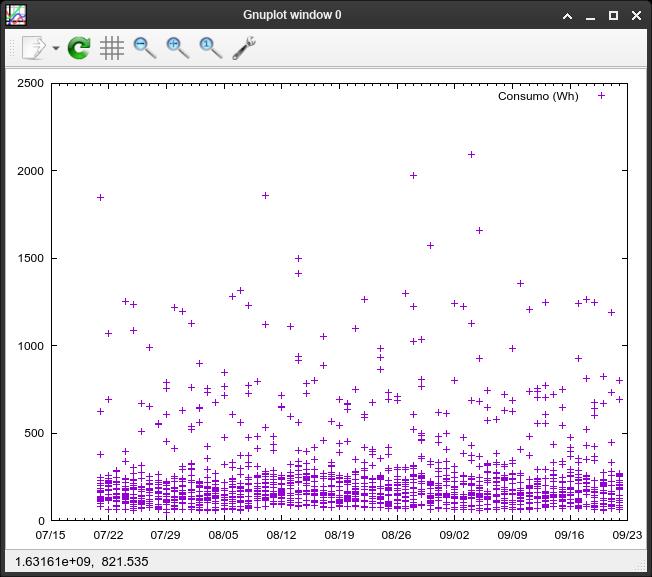
# Show plots directly in the terminal window
set terminal dumb
# Output as a PNG, you can define a width in pixels
set terminal png size 600In case you want to output plots as files, you must specify the file name.
set output 'image.png'Set datafile separator
Define what character separates the fields with set datafile separator '<character>'.
set datafile separator ','Define data format
Set data from an axis to be dates by typing set xdata|ydata time.
set xdata timeThen, define the date-time format of the data with set timefmt '<format>'.
set timefmt '%Y-%m-%d %H:%M:%S'Create a plot
Finally, create a plot with plot '<file>' using <col-number-x>:<col-number-y> with dots|lines|points.
plot 'test.csv' using 1:3 with points- You can specify more options like
title "myplot"orsmooth bezier(check gnuplot help).
More options
Set plot title
set title 'My plot'Set title based on file data
Following command causes the first entry in each column of input data to be interpreted as a text string and used as a title for the corresponding plot.
set key autotitle columnheaderSet axis ranges
Set minimum and maximum value on every axis with set xrange|yrange [min:max]. You can use * to set autoscaling in one of the range limits.
set yrange [0:200]set yrange [*:1200]Add axis labels
Add labels for every axis with set xlabel|ylabel 'mylabel'
set xlabel 'Year'Disable the legend
set key offAdd grid
set gridShow statistics
stats 'data.csv'- You can add
using <colx:coly>(or only one column). - After this command, stats are available as variables:
STATS_mean_y,STATS_mean_x(orSTATS_meanif only one command were used when runningstats),STATS_min_x, etc.
Add more lines
After running stats data.csv using 2, you can add the ‘mean’ line to the plot:
plot 'saldo-cuenta.csv' using 1:2 with lines, '' using 1:(STATS_mean) with linesUnset
Options defined with set can be returned to their default state by the corresponding unset command.
unset xrangeTricks
Pipe a command output to gnuplot
First, create a gnuplot script (e.g.: test.gp), then type your plot options (including set datafile separator if it’s needed) and make sure your plot command refers to '<cat' (instead of a data file):
plot '<cat' using 1:2 with linesNow you can pipe the output of a command to gnuplot. For example:
sqlite3 -csv -header database.db 'select col1, col2 from table1' | gnuplot test.gpGet help
You can type help inside Gnuplot to get more info. Inside help, press Enter to go through a help page. At the end, it will show you a list of subpages: you can type the name of the subpage or press Enter again to go to the parent page or exit (you can also press Ctrl + C to exit from help menu).
You can also check official documentation (PDF).
If you have any suggestion, feel free to contact me via social media or email.
Latest tutorials and articles:
Featured content:

