Veusz: a GUI scientific plotting application
Table of Contents
Veusz allows you to create a wide variety of plots using a graphical interface but with all the power of Python and the Numpy library.
It’s a great program for those who are looking for and easy-to-use program, and don’t want to use the command prompt (although you can use Veusz with the command line if you want).
Installation
Veusz is available on Debian and Fedora repositories (among others) and as a Flatpak. Check https://veusz.github.io/download/ for more info.
First steps
Import data
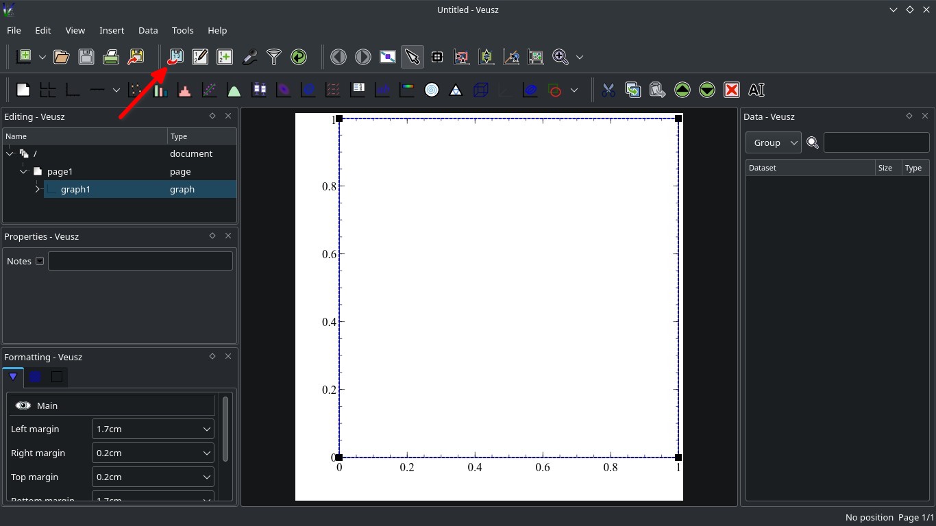
After opening the app, you need to import your data. Click on Data -> Import or on the blue diskette icon.
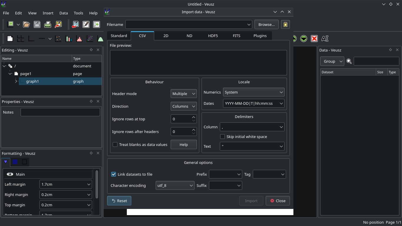
Open a file using the Browse... button. Veusz supports CSV (or any plain text file), HDF5, FITS, QDP and more. Then, depending on the file type, you can specify some options. For CSV, you can specify if your data file has a column header (Behaviour -> Header mode), the delimiter (Delimiters -> Column) or the date format of your data. At the bottom of the dialog, press Import to import the data.
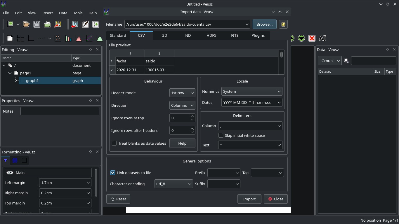
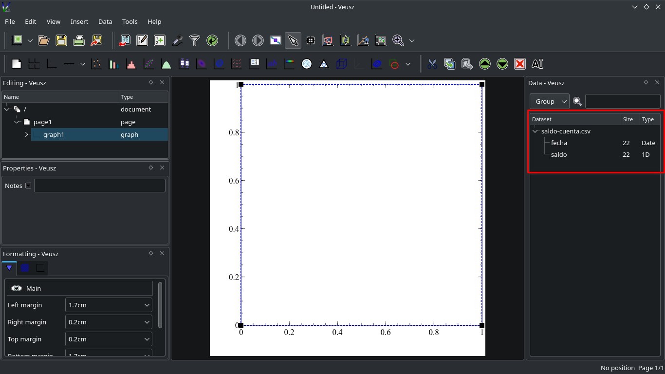
Now you can see your data columns on the right panel. Each column is called a “dataset”.
Add a plot
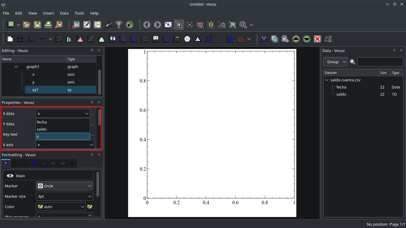
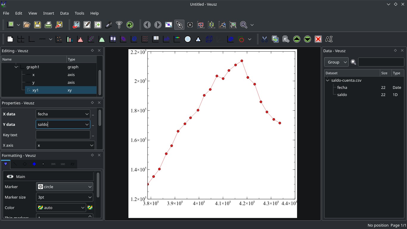
On the toolbar you can see al the plots you can create (points/lines, bars, boxplot,…) and other “widgets” like text labels, plot keys (plot legend), shapes, etc. Let’s create a simple line plot. On the left panel you’ll see the properties of the selected widget. The most important for now are “X data” and “Y data”. If your data has column headers, you need to change the default value to the column name.
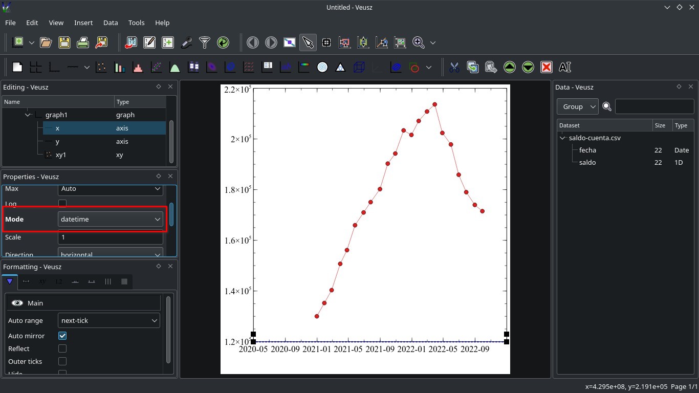
Now you can play with the “Fomatting” options to customize your plot. To change the format of the axis tick labels (you can see in the previous image that the dates are not displayed properly), select the axis on the “Editing” panel, and change “Mode” to “Datetime”.
Export the plot
Click on File -> Export... or on the yellow diskette on the toolbar to export the plot as an bitmap (JPG, PNG,…) or a vector (PDF, SVG,…). If, after exporting as a PNG, you see a transparent background, click on the page widget (inside Editing panel) and uncheck Hide on the Formatting panel.
Documentation
Check https://veusz.github.io/docs/manual/.
Tips
Change the number format from scientific to decimal
Select the axis, on the “Formatting” panel go to the “Tick labels” tab. Then, change the “Format” to %d. There are more format options, check https://veusz.github.io/docs/manual/introduction.html#axis-numeric-scales.
Change datetime format
In a similar way, you can change the datetime format displayed on the axis ticks. Change “Format” from “Auto” to a custom formatting like this one: %VDm-%VDY (to show the month and the year). Check the page from the previous paragraph for more info.
%VDY: Year%VDm: Month (number)%VDb: Month (short text)$VDB: Month (full text)%VDd: Day%VDH: Hour%VDM: Minute%VDS: Second
Add a “mean line”
To add a line to a plot displaying the mean of the data, click on Insert -> Function or on the appropriate toolbar icon (with the description “Plot a function”). On the properties panel, add this expression on the Function input box: mean(DATA('data_1')) (replace data_1 with the name of the dataset). mean() is a Numpy function, check Numpy documentation for more info on available functions.
Create a dataset with the differences between the records of an existing dataset
Create an “intermediate” dataset (Data -> Create... or the icon on the toolbar). Select Expression using existing datasets and add this expression inside Value, replacing data_1 with the dataset name:
resize(pad(data_1,(1,0),mode='constant',constant_values=(data_1[0])),len(data_1))Add a dataset name (e.g.: data_int) a click Create. This will create a copy of the original dataset with the first record repeated once.
After that, create another dataset. Check Expression using existing datasets and paste this on Value, replacing the dataset names accordingly:
data_1-data_intYou may need to change the order of the datasets depending on the data. Add a dataset name (e.g.: data_dif) and click Create. Now, you can use data_dif like any other dataset, and will automatically update if the original data changes.
Reload the data
If the data file has been updated, you can reload the datasets easily: just right-click on the data filename (inside the Data panel on the right) and select Reload.
Filter by dates
You can easily do numerical filtering with the datasets (Data -> Filter..., add an expression such as x>3 and select the datasets to filter) but it’s not that easy with dates. There are two ways:
- Typing the date as seconds since January 1st, 2009. For example:
x>417000000for records after March 30th, 2022. - Creating a “Custom Definition” (
Edit -> Custom Definitions...). Select theImporttab, typeveusz.utilsunderModuleanddateStringToDateunderSymbol list. Close the window and you will be able to add a filter using an expression like this one:x>dateStringToDate('2022-01-01').
Note: always replace x with the dataset name if it’s different.
Add an expression inside a label
Add the expression using this syntax: {% raw %}%{{function(DATA('x'))}}% {% endraw %}, e.g.: {% raw %}%{{mean(DATA('mydataset'))}}% {% endraw %}.
Import several datasets
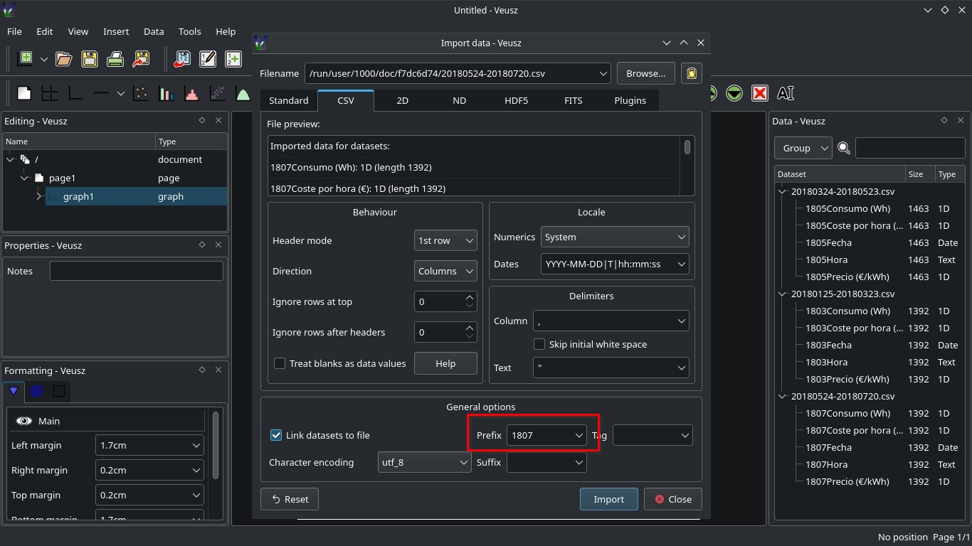
You can only import one dataset at once. If the datasets have the same column headers, by default they will be overwritten. To avoid this, add a Prefix or Suffix to each dataset when import them (Inside Import dialog, General Options -> Prefix).
You can also consider joining the files before importing them (using a Bash script).
If you have any suggestion, feel free to contact me via social media or email.
Latest tutorials and articles:
Featured content:

